> ## Documentation Index
> Fetch the complete documentation index at: https://vendo-mintlify-24213046.mintlify.site/llms.txt
> Use this file to discover all available pages before exploring further.
# Vendo's Full-Stack Agent
> Your agent as a panel inside your own product, in your own brand.
Vendo brings the loop, the model, and the chat surface. You paste three things
into your own client.
This picks up after the two commands on the [main quickstart](/):
```bash npm theme={null}
npm install @vendoai/vendo
npx vendo init
```
```bash pnpm theme={null}
pnpm add @vendoai/vendo
pnpm exec vendo init
```
Wrap your app in the provider. On Next.js App Router this is your root layout —
if you don't have one yet (Next 16 no longer scaffolds `app/layout.tsx`), create
it. Your paths and theme are already filled in.
```tsx app/layout.tsx focus={6} theme={null}
import { VendoProvider } from "@vendoai/vendo/react";
import theme from "../.vendo/theme.json";
// in your own RootLayout, props type untouched:
{children}
```
This is the URL the panel talks to. If your app runs at the root of its
domain, the default `/api/vendo` just works. If your app lives under a
prefix — say everything is served from `/maple` — include it:
`baseUrl="/maple/api/vendo"`.
One line inside the provider puts your agent on every page. It opens over your
app, or docks beside it with `placement="dock"`.
```tsx app/layout.tsx focus={1,5} theme={null}
import { VendoOverlay, VendoProvider } from "@vendoai/vendo/react";
{children}
```
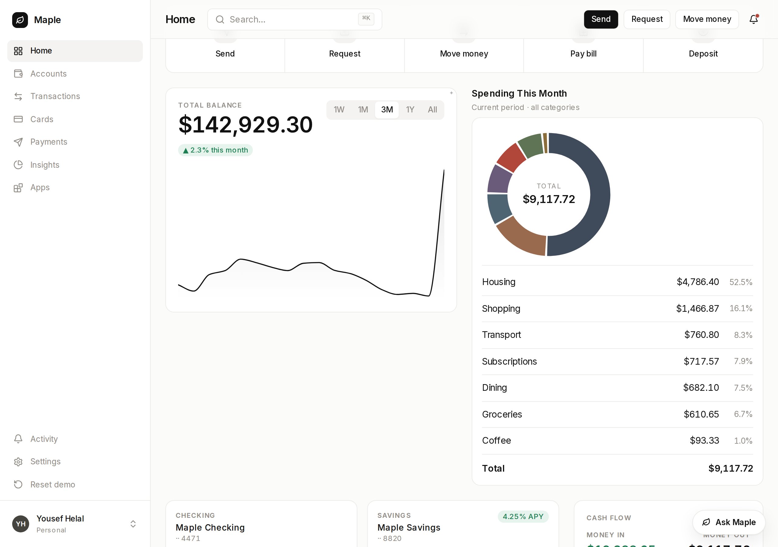
Put a slot where a card would go. A screen the agent builds can live there
instead of in the panel.
```tsx app/overview/page.tsx focus={3,10} theme={null}
"use client";
import { VendoSlot } from "@vendoai/vendo/react";
export default function Overview() {
return (
{/* your own components */}
);
}
```
Empty, the slot shows a ghost with prompts that open the panel. Ask for a
view, press **Pin to dashboard** on the card that comes back, and it renders
in your grid and stays there.
 ## Make it yours
The setup was the same for everyone. These, in order, make it yours.
Swap the demo principal for your real sign-in.
Point Vendo at your API — the agent gets hands.
Decide what runs and what asks first.
Ask for a view, pin it into your grid.
Your fonts, colors, and radii on every surface.
The brief your agent reads before every turn.
## Make it yours
The setup was the same for everyone. These, in order, make it yours.
Swap the demo principal for your real sign-in.
Point Vendo at your API — the agent gets hands.
Decide what runs and what asks first.
Ask for a view, pin it into your grid.
Your fonts, colors, and radii on every surface.
The brief your agent reads before every turn.